How to Support Users’ Light/Dark Mode Preferences in Your Web Application?
Your website will be used in many contexts, and you should ensure that it can adapt to them. We have responsive websites for different screen sizes—a layout that changes to fit the screen width. Similarly, we can make sure our website looks good in the dark. In this article, I'll show you how to switch your web application automatically to dark mode—thereby ensuring that your users are always interacting with the version of your app that best suits their needs.
What is dark mode, and how to control it
Dark mode is a color scheme optimized for use in a low-light environment. Usually, it inverts the traditional color combination and uses light letters on a dark background. Light or dark mode is controlled by either the operating system or the browser. On macOS, you can select one of three options:
- always light
- always dark
- auto—light during the day and dark at night
Some browsers—for example, Firefox—either use a theme based on the OS setting or allow the user to override it on the browser level.
How do websites use switch to dark mode to respect users' preferences? With the media query option prefers-color-scheme, which is supported by 93% of browsers according to Can I use data.
How other websites look in dark mode
Many websites already switch to dark mode automatically based on the users' preferences. For example:
Google:
Twitter:
Why you should support it as well
As others have pointed out, supporting dark mode increases accessibility for your web application. Some visual impairments cause users to prefer viewing websites and applications in dark mode. Thus, by implementing it in your application, you make sure everyone in your user base can use your product effectively.
Besides accessibility concerns, for many users, dark mode is their preferred way of using applications. When the operating system is set to dark mode, most of the interface elements become dark. With many applications and websites following this setting, any application that sticks to the bright colors stands out negatively because it forces the bright colors onto the user.
Example with CSS variables
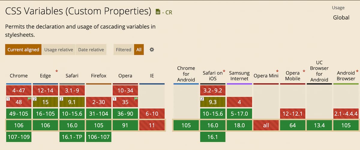
In order to support two color schemes on your website, every color on your website has to be set twice—for the light and the dark mode. To avoid code duplication, you can use native CSS variables—they have widespread support (source):
You can use it very easily in any web application. You define two files defining variables:
styles.light.css:
:root {
  --main-bg-color: #fafafa;
  --main-color: #000000de;
}
styles.dark.css:
:root {
  --main-bg-color: #303030;
  --main-color: #fff;
}
Then, in your main style file you use those variables for styling and import the color mode file based on user preferences.
styles.css:
@import url("styles.light.css") (prefers-color-scheme: light);
@import url("styles.dark.css") (prefers-color-scheme: dark);

body {
  background-color: var(--main-bg-color);
  color: var(--main-color);
}
Here you can find the example code, and the website in action
Depending on your use case, you may need some fallback values to ensure support for older browsers, styles.css with fallback:
body {
  background-color: #fafafa;
  background-color: var(--main-bg-color);
  color: #000000de;
  color: var(--main-color);
}
Looking for more support for your Angular projects?
Our team at DevIntent is highly experienced in web development, including framework migration and updates. Check out our offerings or reach out.


